BRANDING
WEB
brewing up
a bold new
coffee brand
MY ROLE
Art Director
CLIENT
Ryan & Jacob Matchstick
OVERVIEW
Matchstick Coffee Co. (MCC) is a small-batch coffee roaster based out of Seattle. Brothers Ryan and Jacob Matchstick founded MCC on the pillar of quality over quantity. They pride themselves on their hands-on approach to crafting the perfect blends and wanted to build a brand that infused the same handcrafted feel. The brothers commissioned me to design a brand that speaks to their rich and rugged roasting roots.

HOMEPAGE

CHALLENGE
Launching a successful coffee brand in Seattle amidst fierce competition was no small feat. To ensure a successful brand identity for MCC, I worked closely with owners Ryan and Jacob. I began gathering insights from the brothers' business goals, their past learnings from previous partnerships, and the coffee roasting industry's best practices. I analyzed competitors and how consumers perceive them. Through that research, I was able to identify branding opportunities for MCC and form a branding strategy that would allow MCC to stand out in an already saturated market.
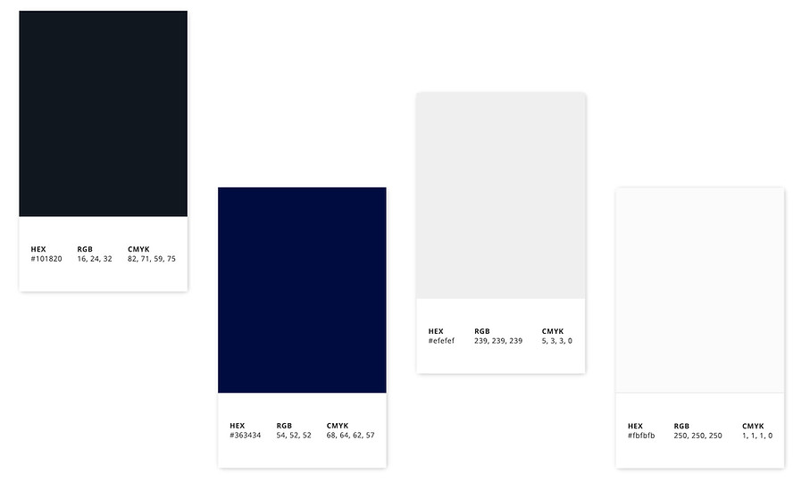
COLOR PALETTE

WORD MARK

MONOGRAM

EMBLEM

RESULTS
I designed a visual identity for MCC that strikes a long-lasting impression on its audience. The identity speaks to the passion that the Matchstick brothers share for their craft of coffee roasting. Where most coffee roasting brands feel like unpolished startups or overly refined corporate coffee, the MCC brand strikes a balance of being ruggedly appealing while remaining distinctively mature. The identity's balance enables MCC to compete with local shops and global heavyweights.
PHOTOGRAPHY AESTHETIC


TYPOGRAPHY


WEBSITE DESIGN COMPS


